THE CURTAIN JOURNAL / PRACTICAL INSPIRATION
A curtain palette that belongs in your room
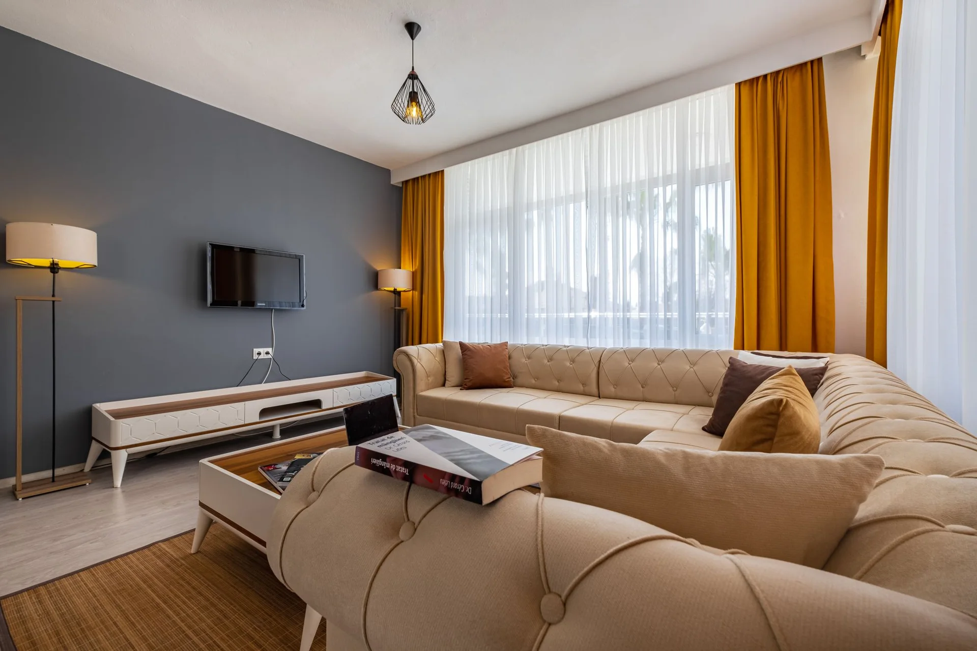
Choose a color with the walls, floor and changing daylight in view.
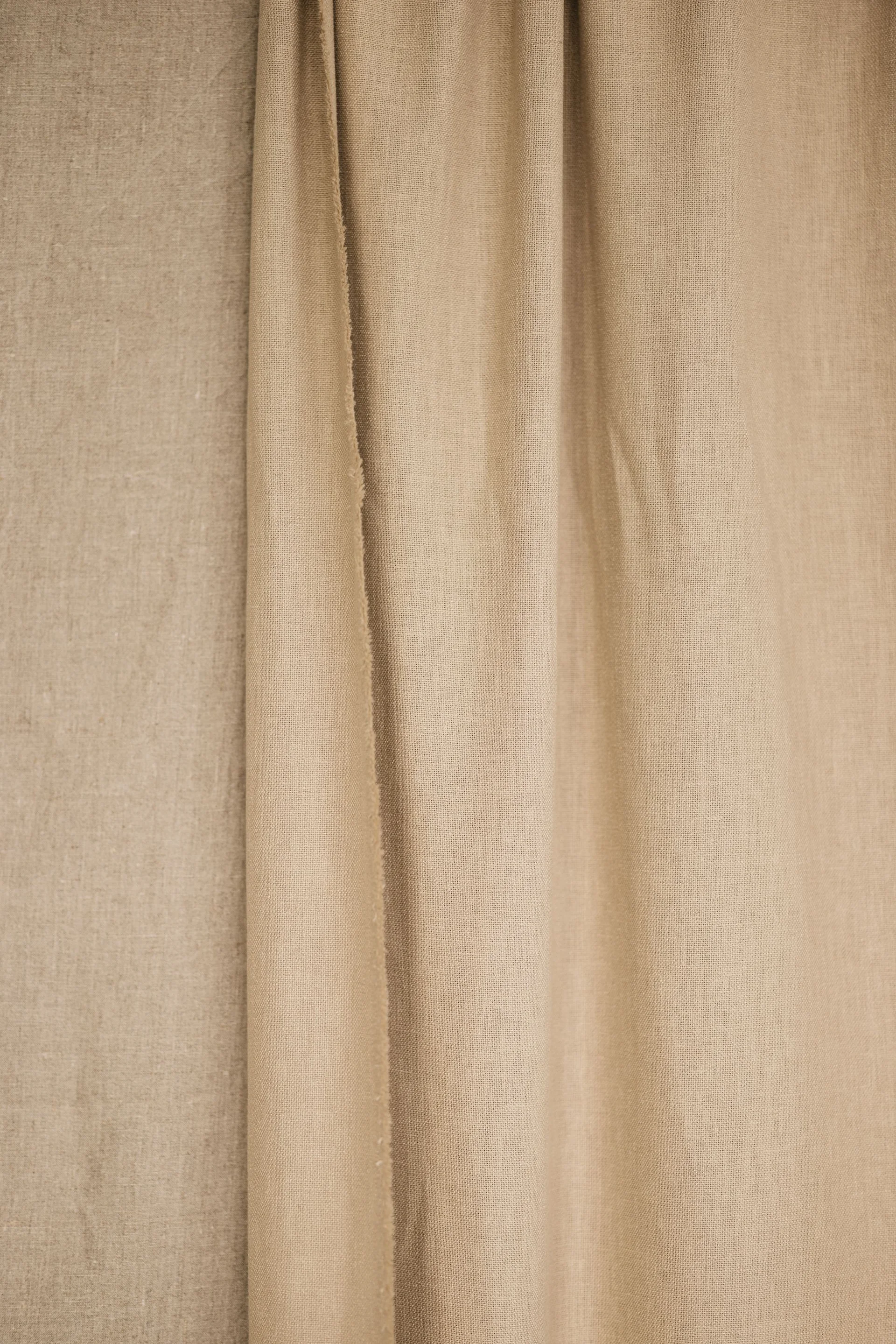
Look for the undertones already in the room. Warm timber and cream walls may suit a different neutral from cool stone and bright white paint.
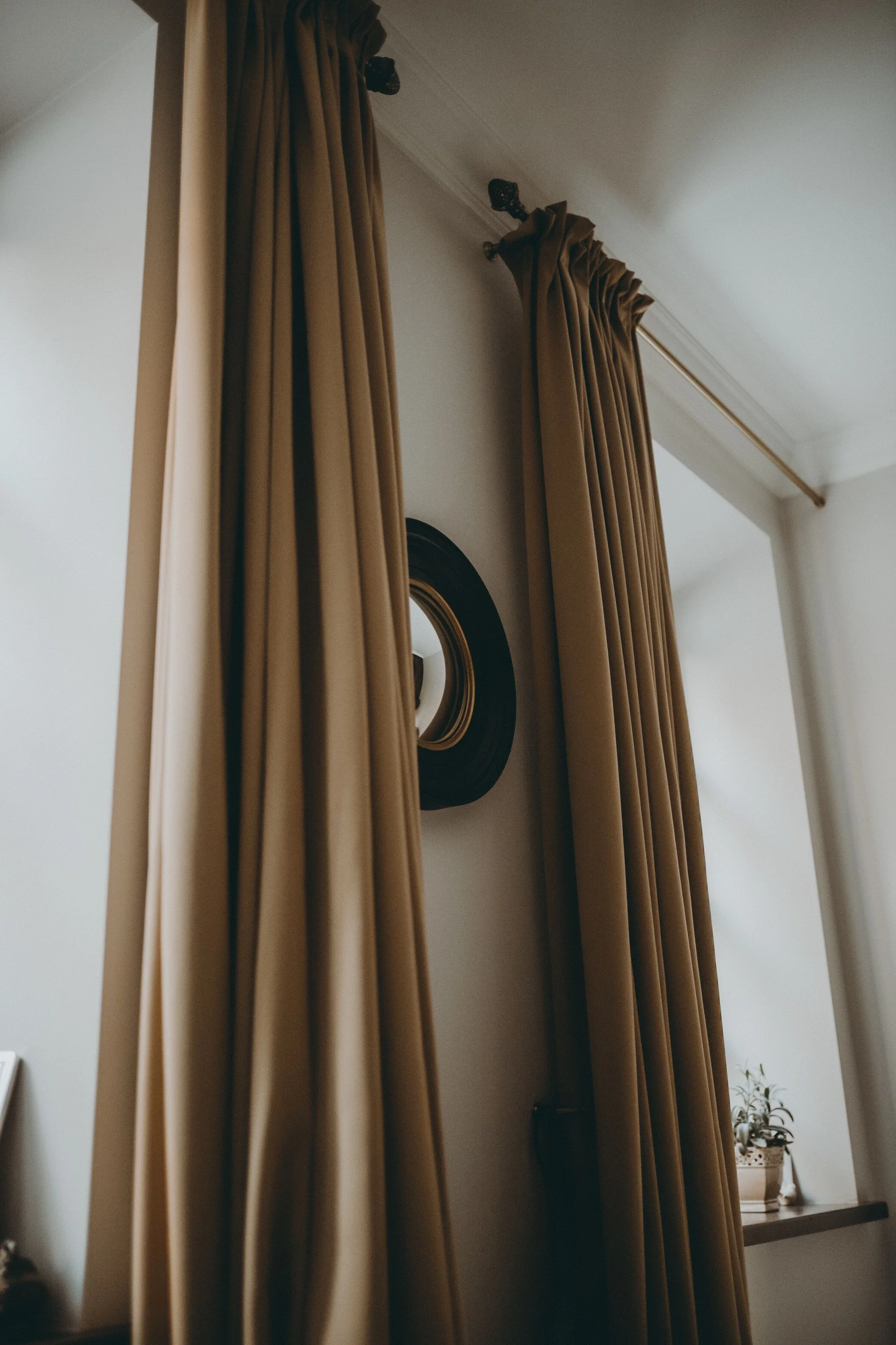
A close match to the wall can make a window feel quiet. A deeper color can frame it, especially when the curtain has enough space to stack beside the glass.
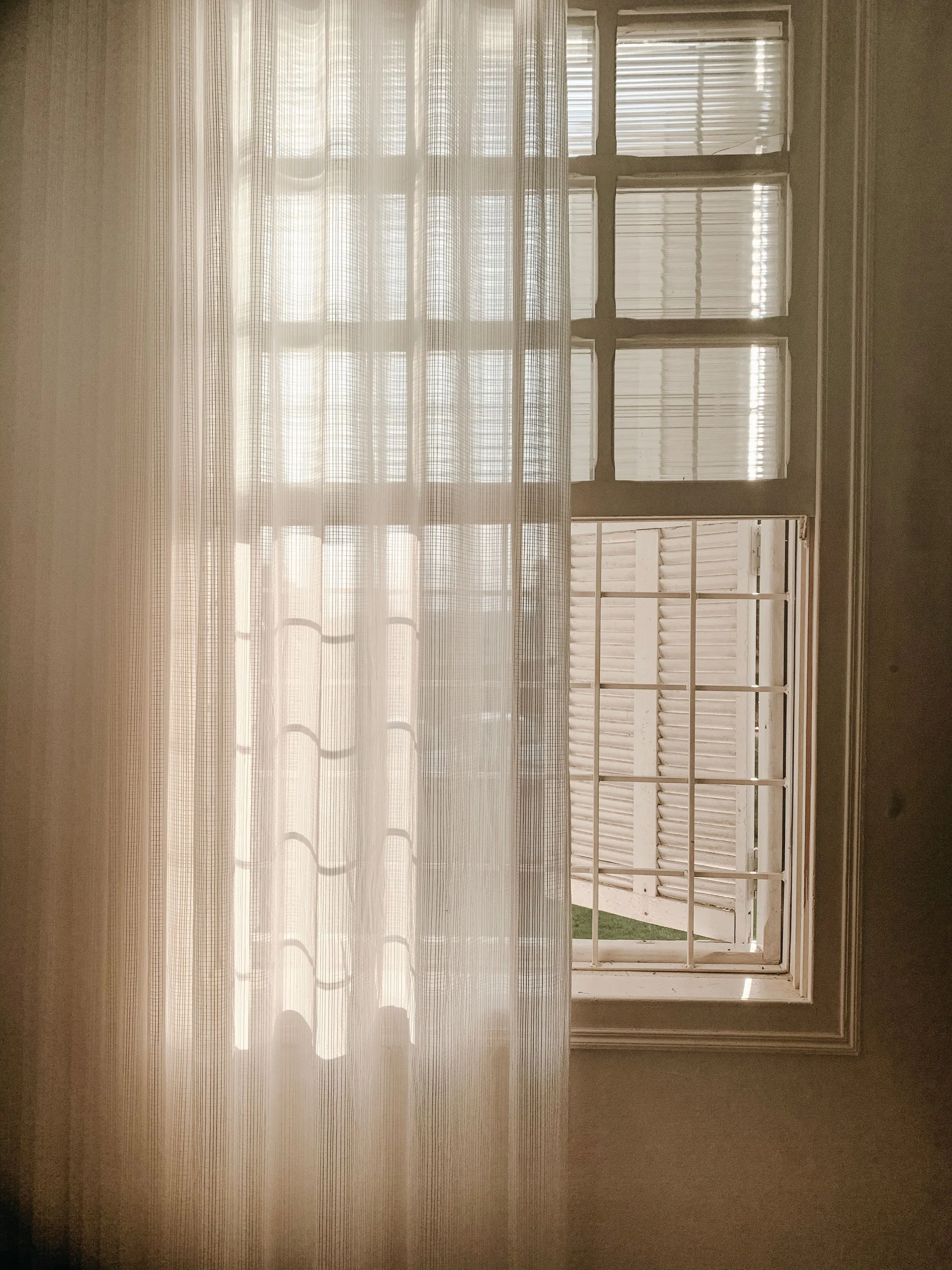
Compare large samples vertically rather than a tiny swatch on a desk. Fabric texture, folds and backlighting all affect the apparent color.
Use a visualization to explore possibilities, then confirm the final shade with a physical sample. Screen colors and generated images are not a color guarantee.